Showing posts with label photography. Show all posts

Saturday, August 04, 2018

Print mounting

I am on vacation and finally had a bit of time to mount some of my prints, which I am going to hang in my home office. The home office is rather more important as the hospital has decided to remove our offices because there are workplaces at the operating and intensive care departments. That any doctor would have "stuff" or "papers" is apparently nonsensical. The patient data management system is digital now, and thus we do not need papers, and do not need a personal space.

Anyway, mounting prints is almost as much of a discussion point in photography as all the other things. I learnt how I do it from a Luminous Landscape tutorial, but since I mostly mount smaller prints I eschew hinging the mats, and mostly only mount with mounting corners. We will see.


First and foremost we knoll, as we learnt from Adam Savage through Tested.com. We have four prints and five sets of frames, backs and mats. So, we'll have to find a final print somewhere. When we haven't decided which prints to mount it is an idea to get symmetric mats so that we can decide which whether to use portrait or landscape orientation later. If we know which print we will mount, then slightly asymmetric mats with a thicker lower edge is often more elegant. Let's start with the elephant.


Step one is to place the print and fit the mat. An important point is that it shouldn't  move until it is fixed in place, for that purpose we use a weight. A, flat, clean and heavy weight.


With the weight in place we then place the mounting corners. Since these are small A4-size images, they will stay in place using just corners and the mat. Once the picture is securely mounted, we need to double-check that it fits the mat so that we don't find any mistakes after we mount it.


The frames are Nielsen aluminium profile frames that we put together with these simple corner fixtures consisting of a right-angle plate with two set screws and a shim to distribute the force on the aluminium. In addition there are two hanging fixtures to slide in, and fasten with set screws. For now we will leave one side unmounted to be able to get the print in.


Before sliding the mounted print in, we peel the cover off of the plexiglass and place it on the matted picture and make very sure there is no dust in between. A simple dust blower makes short work of any dirt. By now we really should have signed the mats if we wanted to do that.


In order to keep the stack of backing, print, mat and glass in place the Nielsen system uses leaf springs that you push in under the edges of the frame. I tend to use two per side for A4-size prints.


The last step is to put some hanging wire in place. By only twisting one side to start with it is easy to regulate the height when we actually hang the prints. Oh, and that's one, now for the other four, whereof one needs to be selected and printed first.

But, after all that I have more of my own art on the walls, which is nice. Thank you for following along.

Sunday, January 04, 2015

Fujifilm X100T first impressions

My Fujifilm X100T arrived on January 2nd so I have had all of two days to try it out. A while back I wrote a list of what I would like to see in the X100S replacement that was anticipated for Foto Kina. There were nine items on the list and most have been fulfilled, or at least significantly improved with X100T.
1. The burst mode does not lock the camera so it is possible to take another burst almost directly. 
2. There is a setting for release priority, and it is separate for continuous and single shot focus so that you can have one for each. 
3. There is no tab on the focus wheel, nor is there always-on manual focus. However, the manual focus is excellent with split-screen, peaking, and 100%-preview modes. 
4, 6, 7, & 8. While there are no dedicated switches, there is a drive-mode button for selecting single, continuous, bracketing, or film mode, and there are seven programmable buttons that I have programmed to cover my needs. 
5. There is no dedicated ISO dial. Although, I have high hopes for a firmware update that lets you use the exposure-compensation dial for ISO. It should be easy, really
9. While there is no touch screen, the buttons are much better with a dedicated back button to get out of menus.
As you see, it still does not have a manual ISO dial, but otherwise I am happy. It is a massive improvement above the X100, which, given how much I liked the X100, is no idle praise. The film simulation is particularly useful when working in black and white, I have the camera set that way and have Adobe Lightroom set up to import as low-contrast black and white. It works excellently. High ISO is excellent up to 6400. I haven't had use for higher ISO seeing as I am only in Sweden in January, and not in a mine. Macro shooting also works well, at f2 the actual focus seems to lie slightly in front of the apparent focus using peaking manual focus, and autofocus is not the most accurate. Honestly, f2, autofocus, and macro are three things that don't generally go together. So, I can't really fault the camera for that.

Here are some examples from the first days of shooting. As you see it works right out of the box for boxer snaps.

With a little bit of thought it can take quite nice portraits.


And night-time shooting at ISO 6400 is no problem and gives very presentable result.


Sunday, December 28, 2014

Your move, Fujifilm!

This is what I have:


This is what I want:
And the page to do it is already there:

Please, please, pretty please, upgrade the X100T so that ISO can be controlled with the exposure compensation dial!

Thursday, September 11, 2014

Fujifilm X100T

Fujifilm announced the X100T and Zack Arias has a review up on DedPxl. It has a larger buffer for continuous shooting, a better back-contol layout, and a digital rangefinder to make manual focusing better. In addition, its faster, has higher resolution (than the x100), larger screen, and is a little bit thinner. All good in my book.

Sadly, it does not have a mechanical ISO dial, but I have a solution for that. Fujifilm could easily release a firmware update that makes it possible to use the exposure-compensation dial to set ISO. We who like that could then make a little sticker to place over the top, and we'd be all set.
So, please Fujifilm. Pretty please, make a firmware update to make it possible to use the exposure-compensation dial to set ISO. I think a lot of photographers would be very happy.

Wednesday, July 30, 2014

Wishes for the Fujifilm X200

With photokina right around the corner I have suddenly started shooting a little again. The X100 is still a magnificent camera, but I have some gripes and some hopes and wishes for the next iteration. A lot was improved with the X100S but not enough for me to buy a new camera. However, the Fujifilm X-T1 has many of the asked-for features, which shows that Fujifilm is heading in the right direction. Here is a list of what I would like to see in a new X200 (or whatever they will call it).
Concept for the new X200, very similar to the old X100/X100S but with some new switches.

  1. Continuous shooting with a proper buffer so that it is possible to continue shooting immediately after a short burst. On the Canon EOS1D you could shoot a burst and shoot another burst immediately. Even on the X100S you have to wait interminable seconds even if you only shot a two-picture burst.
  2. Shooting priority shutter release. That is, when the button is pushed all the way down the picture is captured, no waiting for autofocus, no nothing.
  3. Focus tab on the focusing wheel with always-on manual focus that automatically brings up digital split image or peaking. (On the lens focus wheel)
  4. Dedicated shooting-mode switch: Single - Macro - Continuous. Macro is in the middle because if you shoot macro you have the time to be precise when changing mode. (Drawn on the left top edge)
  5. Dedicated ISO-dial that you have to lift to turn to automatic. (Below the shutter release)
  6. Dedicated flash-mode switch. (Behind the flash shoe)
  7. Dedicated film-mode switch (Under the shutter-speed dial) with a lock button that you need to press to change it. A lock button that you also need to press to select A, B, or T on the shutter speed. (On top of the shutter-speed dial)
  8. Dedicated switch for the neutral density filter. (Behind the shutter-speed dial)
  9. Larger menu and arrow buttons, a dedicated back button and a large touch screen.
In short, I would like more manual control with easily visually verifiable settings. Oh, and a faster camera. 
Here is a picture of Madicken and her new friend Vilde captured with the X100.

Sunday, April 14, 2013

Renovating Jigoro Kano

Most judo clubs have a picture of the founder, Kanō Jigorō (28 October 1860 – 4 May 1938), close by the practice area. It is supposed to hang on the front wall. That is, the wall you face when entering the dojo, called the shōmen (front wall), or kamiza (high seat). The latter because before the advent of the picture that was where the head of the dojo would sit, and over-see practice (As in the below illustration by Shuzan Hishida).
In Bergen the picture had gone missing, and in Uppsala it is a framed but dilapidated poster. Anyway, I decided to get a new one, but quickly found out that it is all but impossible. As a photographer, and, if I say so myself, not a bad printer, my next thought was to find a picture online and print it. This is the story renovating a scan of an old Jigoro Kano portrait for printing. Luckily, by Japanese law any photographs taken before 1946 are part of the public domain (or that is what Wikipedia says).

When working with a picture you obviously want to start with the highest possible quality and resolution, and with a bit of work I found this rather good scan at 3543x4375 pixels (click on the picture to go to the original URL).
It is only a j-peg but with that kind of resolution you can do a lot without destroying it. This is good because there was a lot to be done. There are scratches that seem to be from the original photograph, including one prominent on his left eye-brow. There are some blotches on the background, and I do not want the text or the old name-badge. Finally, it is made from an old tinted photograph, and I don't like the tint.
So, I loaded the image into the old editor, i.e. Adobe Photoshop, and cleaned it up. I tried to upload the actual TIFF to Wikimedia-commons, but that didn't work so I have just uploaded the final j-peg. If I find another place to put the layered file I will, and then you can easily adapt it to your needs. It prints quite well up to A3.

Thursday, December 20, 2012

Tai-otoshi - free judo illustrations

Click the image to reach the illustration-library at Flickr, or you may cut and paste this URL: http://www.flickr.com/photos/hultstrom/sets/72157632298341948/
Image is free to use under the Creative commons - attribution - share-alike license.
At our judo club in Uppsala we have been looking over the graduation hand-outs that have been used for years. They are just lists of techniques with some illustrations. The illustrations are a mix of horrid old photocopies, illustrations stolen from different books, and some hastily drawn stick figures. There are two problems with this. First, they are mostly bad, and secondly they are either copyrighted or of uncertain copyright status. In an effort to fix this we went looking for creative commons or other freely available judo illustrations on the internets.

There are photographs for some techniques on wikimedia commons that are not terrible, there are even some illustrations, although mostly not so good. At judoinfo everything is copyrighted, and frankly the quality is not always what you would hope for. In the end we were not able to find more than a handful of usable images, which explains the quality of our present hand-outs as well as the quality online in general.

Since I clearly haven't got enough shit to do, we decided to create a set of illustrations and release them into the wild for the judo community to use and spread. All those books are great, and we all have them, but the children don't and they never will. So, here are (or will be) a collection of free to use illustrations of judo techniques. They are provided under the Creative commons - non-commercial, attribution, share-alike - license, which means that they are free to use for non-commercial purposes as long as they are properly attributed, and any derivative works are also shared freely under the same license.
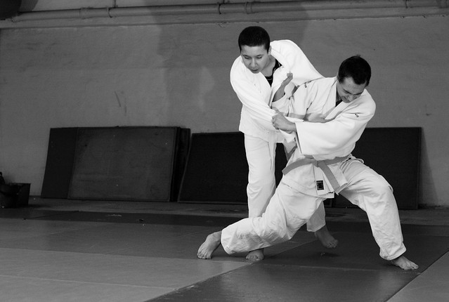
Original tai-otoshi photograph. Copyright Michael Hultström 2012.
First out is Tai-otoshi, or body-drop. Mostly because that was one I had a good photograph of to use as template. Don't expect this to go quickly, but give us a year or two and there should be fair number of images to use. Quality-wise I will be aiming for proper vectorised line-art in the end, but that is even more work and will take even more time.
Edit: I have been convinced that the non-commercial license is too restrictive as it potentially limits uses I would like to allow. Thus, the illustrations are now re-licensed as attribution, share-alike.

Saturday, November 17, 2012

Dogphotobooks

There are an insane number of pet pictures on the internet and there seems to be another book of puppies every other day, but when you like photography, books, and dogs you have to try to find something worthwhile. First in line is a thick thing that at a distance looks like any other book of puppies, but isn't. The Taschen published A thousand dogs is a thick (yes, Thick), soft-bound thing with 1000 (I assume) photographs of dogs.
However, instead of a collection of the 1000 currently cutest and cheapest pictures they could find they have collected a comprehensive historical selection of dog photographs. From 1839 and forward. The first are simple posed photographs made with some of the first cameras ever made, clearly showing the central role of dogs in our society across the years.
The book is divided into sections by years and includes some quite well-known photographers and photophraphs. The reproductions are quite good, at least matching the quality of the binding. It is a an interesting book both as a history of photography and for the wealth of images (of dogs), some of which are quite good.
Second out is the leading photographer of posed dogs, William Wegman. He has produced a number of books with his Weimaraner dogs. I picked the book Polaroids with pictures from an impressive 20x24in large-format camera. 
Some are more or less silly Weimaraners in clothes, but some are exquisitely posed humanesque dog photos. Let me just say that these are nor pictures you could make with boxers. No boxer I ever met would stand still matching paws with another boxer posing as it's shadow. At least not for long enough to make a large-format photograph.
Weimaraners, however, seem perfectly suited to the job. Some of the images are accompanied by short stories about how they were made and what Wegman was thinking or trying to create.  The book as such is a quite well-made soft-bound book of a size that is easy to handle. The reproductions are fine, and the dogs are cute.
Another book of posed dogs is Tim Flach's Dogs Gods. It is what we in Sweden call "praktverk", no expense has been spared. The binding is excellent, the format is non-standard. There are different high-quality photos on the binding and the dust-jacket. The reproductions are among the best available for large-production colour printing.
It is not quite as luscious, and not nearly as varied or complete as his book about horses Equus. Almost all photos are carefully posed and lit images. With only a few natural light - natural behaviour images sprinkled on top.
As with Equus there are some images that by their setting must have been taken in the wild but with lighting and posing that are nothing short of miraculous. Among dogphotobooks, this is the most equal of them all.
The nestor of dog-photography is Magnum's Elliot Erwitt. Elliot Erwitt's Dogs is a new collection of some of his most iconic dog photographs, as well as a number less well-known pictures. It includes a foreword in English, German, French, Spanish and Italian (as any proper book should). Elliot Erwitt represents the opposite of Wegman and Flach in that the book is all black and white, and while there are some studio shots the vast majority of photographs are of dogs doing what dogs do. They are ungroomed, sniffing each other, licking themselves or just taking a piss. If they are posed it is just the look-at-the-camera pose, or, they might be barked at. Something Erwitt is known for doing.
The book is a very nice folio hardback with excellent reproductions, although as is common with high quality black and white reproductions there is a bit of gloss differential. The book is too big to hand-hold but just right for opening in your lap while sitting in a leather armchair sipping a whisky.

Saturday, October 27, 2012

Polar Obsession

Photobook review time! I just bought a new photobook: Edward Weston, Life Work offered as a special deal on The Online Photographer. It is the most expensive book I ever bought. No sorry, it is the most expensive non-work-related book I ever bought. Anyway, two days after the offer started the book sold out, now there are only some Special Edition books left.

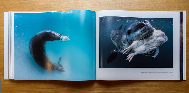
However, I don't have the book as such yet, so this time it is Polar Obsession by Paul Nicklen. It is published by the National Geographic, and is absolutely stunning. Good format, slightly squat and not too large for having in one's knee. It is however to large for hand-holding. The binding and the paper quality are excellent and the reproductions are really nice.
There are a huge number of these amazing photographs accompanied by fascinating little stories. Like one about a female leopard seal that tried to feed him penguins. But don't read it here, listen to him tell the story himself:
This is really one of my best photobooks, and it wasn't even that expensive.

Wednesday, June 06, 2012

Photographic necessities

Coming back to serious photography entails some additional expenses. Foremost being the latest version of Photoshop Lightroom, at the moment version 4. I spent quite some time testing raw-conversion and image database software some years ago. GIMP was fun but useless, not because it is impossible to do the stuff you want to do but because it is so complicated. Capture One was sleek and very nice, but head and shoulders above the rest was Lightroom, version 2 at that time. Subsequently I have also tested the combination of Adobe Camera Raw and Photoshop. Lightroom is based on Camera Raw so the difference shouldn't be that big, but it is. Lightroom is much more focused a on photographic workflow, while ACR and PS are supposed to be able to do everything from science to design.
Previously there were some things you had to go to Photoshop to do well, or at all. Keystone-correction was one of them. Now it is available under "Lens Correction" if you change from "Profile" to "Manual." I find it makes almost any picture look better, the background becomes less intrusive if it is rectilinear, and you just get the feeling of technical quality. For pictures such as the first one, it is absolutely necessary. Either you shoot it with perfect alignment, or you correct it. With sloping verticals it doesn't work at all. In the second it is not as important, but I think it improves the feeling that the image was made with precision.
For the last one it is maybe the most important. Either it is a snap-shot with some toys and a dog, or it is a well-aligned architectural photograph that uses the toys to lead into the image where the dog is. I find it makes all the difference. These are images that you would otherwise need a tripod and a tilt/shift capable camera for, and really quick too, if you wanted the boxer where she is.

So, how did I find this out? This is the second photographic necessity, I would argue, for all serious photographers. At least if you don't have an imp employee who does post-capture for you. You go to the Luminous-Landscape, click on "store" and buy their Lightroom 4 tutorial. With intro if you haven't used it before, without if you just haven't used version 4. It is the best instruction to be had for money. Well person-to-person teaching might reach the same level, but arguably not in the evening after the family has gone to bed, which is when I have time. Buying Lightroom without the tutorial is like buying a car without a key.

A walk in the park

Swedish national holiday, the government decided that Sweden should be more like other places and celebrate a national holiday. The Swedes are reluctant to say the least. It's fine to celebrate midsummer or Valborg (last of April), but you don't celebrate Sweden as a nation. However, you get a day off, so I went out with my new and Shiny™X100 for a stroll.

Not quite clear what it is supposed to be, but drawn by one or other of the kids in the neighbourhood with street-crayon. These kind of stylised, rectilinear things are perfectly corrected using "Enable Profile Corrections" in Lightroom 4. The slight barrel-distortion and vignetting disappears at the click of a button.

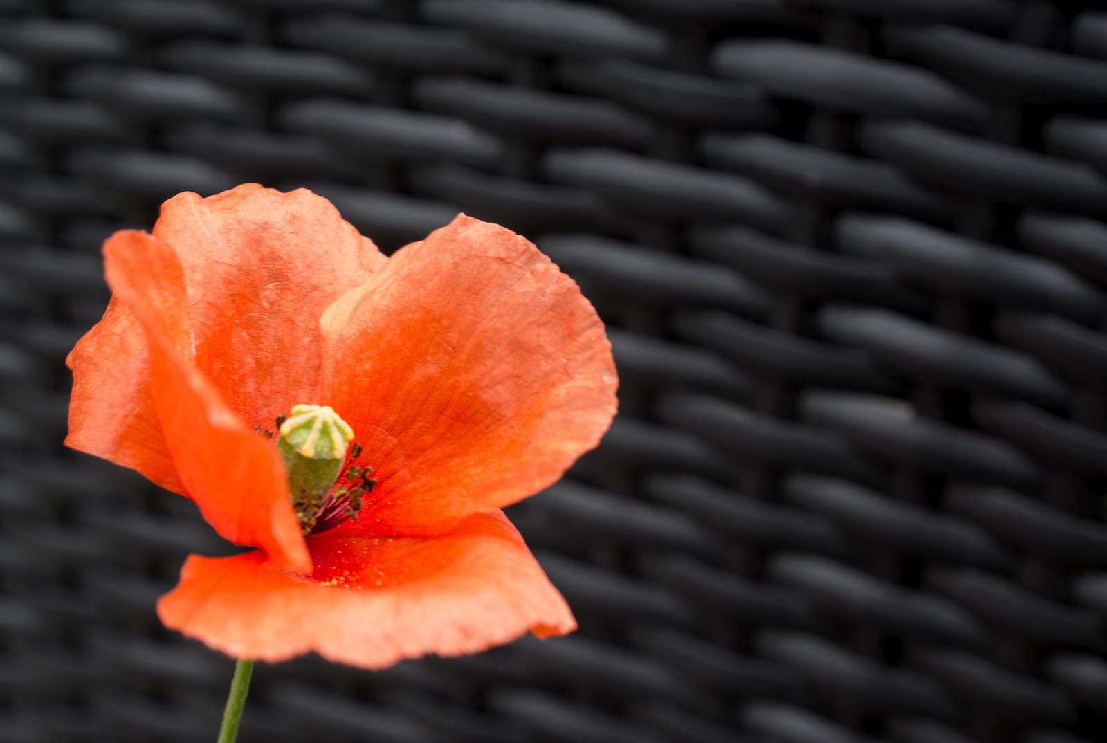
Poppy in front of lawn-chair. The macro capabilities of the X100 seem excellent. A thing that bothers me is the slow focus-update in macro mode. Another thing is that it seems quite difficult to achieve critical focus just where you want it. It may take a bit more practice is all.

Tagged utility-box. Critical focus is easy if the subject is flat, contrasty and in good light.

More macro, flower work.

Black and white is also fine.

River Fyris, more like a creek of mud. Still, it is pretty in black and white.

I found the X100 easy to work with. The finder is excellent, and the ability to switch to EVF for critical framing is brilliant. I still get lost in the variety of display and finder-options, but with any luck that will improve with experience. Most controls were easy to find, and usable even without moving your eye from the finder. It is annoying that the menu-system sucks so badly. Switching between manual and automatic ISO should be simpler. All options that you regularly use when shooting should be in the same place. Those would be ISO and auto-ISO, flash-compensation, external flash, ND-filter, Self-timer, and Dynamic range. The separate macro function should be done away with. As it is you have to use the macro mode from portrait range, and then you loose your window-finder and get an EVF that isn't fast enough for portrait work. You should be able to frame using the optical viewfinder even in the macro-range, no matter how inaccurate, it is still faster for capturing expressions.

Physically it is of a good size to walk around with. Certainly lighter and smaller than a Leica. Now I am using it with the filter adapter and lens-shade, half-case and strap. The lens-shade does make it too large for a jacket pocket, and the strap is too wide and too long, but apart from that I find it well made. The half-case fits perfectly, and provides just enough of an edge to grip it well with one hand. All told, I found it quick and easy to work with and quite intuitive, and the files are awesome.